A major cog in the inbound machine is the landing page. When I say landing page, you might be thinking of a page people see when they first arrive on your site – maybe your homepage, or a product/service page. You’re not necessarily wrong. But what I’m talking about here is a page which serves as a gateway to a piece of consideration content. good landing page should clearly communicate the value of what’s on offer, inspire action from the users, and ultimately, look good while doing it.
To help you get a sense of what good looks like, I’m going to analyse some landing page examples, and rate them with a reaction from the great RuPaul. Just because I’m obsessed with RuPaul’s Drag Race at the moment.
Landing pages: the good, the bad and the ugly; with reactions from RuPaul
Intercom – How to increase sales through livechat webinar
RuPaul’s reaction:

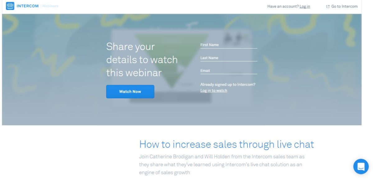
To kick us off – this one from self-proclaimed live chat disruptors Intercom. It’s ok, but I can definitely see room for improvement.
Content: A pre-recorded webinar on using live chat to increase sales.
What’s good:
- There’s a bullet-pointed list of what the user can expect to learn from the webinar – clearly communicating the value proposition.
- The call-to-action (CTA) text – “Watch now” uses strong action-oriented language.
- They’ve stripped back navigation to focus the user’s attention on complete the action they want them to – which is filling in the form.
What I’d improve:
- The big one for me is what you see “above the fold” – in this case, you see the form and a big heading saying “Share your details to watch this webinar”. Coming in cold, I don’t know what I’m signing up for until I scroll down the page. This is a big no-no – why would I fill in a form before I’ve read about what I’m getting? Move the title of the webinar and the blurb above the fold – keep the form prominent but make this prime real estate about what the customer’s getting, not what you want them to do.
- Value exchange – by this I mean the amount of information Intercom is asking of the user to get access to the webinar. While it’s nice that they’ve kept the form short and simple – name and email – I think given the nature of the content they could have pushed it further and added a few more fields, perhaps taking the opportunity to find out the user’s role and organisation. A webinar which took time and effort to put together and record is pretty valuable – make the most of it!
- The imagery isn’t particularly engaging – I get what they’ve tried to do, which is almost literally hide the content behind a blur layer, but it just looks a bit flat. Given Intercom have a strong brand in their use of illustrated characters, they could use some engaging imagery to draw the eye.
Optimizely – Winner Experiments and Customer Stories guide
RuPaul’s reaction:

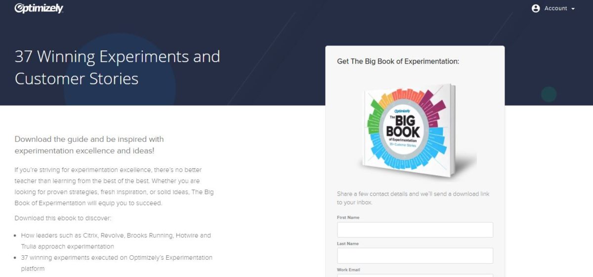
This one is from A/B split testing tool Optimizely – you’d hope given their expertise they’d managed to hone this one to perfection. Not quite.
Content: An impressive 70 page guide with customer stories and examples showing A/B tests and their results.
What’s good:
- Clear, concise copy with a bullet-pointed effectively communicating the value of this content – not to mention the inclusion of a number “35+”, which gives the content an almost quantifiable valuable.
- The value-led content is above-the-fold, and you can see straight away what you’re getting when you land on the page.
- For the content they’re getting, Optimizely are asking the user for the right amount of information.
- Name-dropping – they’ve given the user a taste of some of the big names included in the guide, helping them to envisage themselves on the same platform as these brands.
- The CTA text – “Get your copy” – is clear and action-oriented.
What I’d improve:
- Brighten it up a bit – while the copy is ticking all the boxes for me, I think to make the page a bit more eye-catching and engaging they could include some imagery, or maybe even a contrasting action colour to make the CTA stand out. The blue hues are on brand, but they’re not popping for me.
- Get rid of the logo carousel – while it’s nice to show off that you’re working with some big names, I don’t think this is needed on this particular landing page. Not all of the brands whose logos appear are included the guide, so you’ve got an expectation problem, and for me, it just feels like an unnecessary addition to the page. Clean and focused is what you want to go for with your landing page.
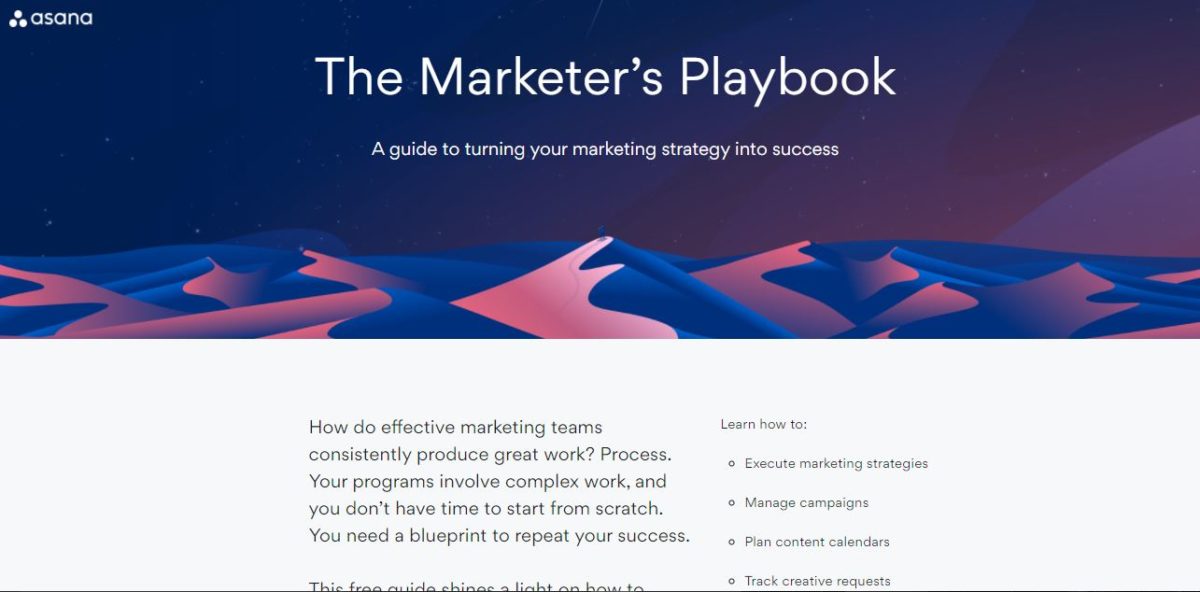
Asana: Marketer’s Playbook
RuPaul’s reaction:

It took me a while to find a landing page which I was willing to call “almost perfect”, but this one from task and productivity management tool Asana is worthy.
The content: A step-by-step guide to putting the right processes in place to carry out your marketing strategy.
What’s good:
- It looks nice – while looks aren’t everything, it’s certainly a better experience as a user to land on a page which is visually pleasing and engaging. It’s even got some nice metaphorical imagery – this guide is like the North star for the user to follow on their long trek to success. Nice.
- Short but effective copy – there’s just 77 words on this page (I counted), but they clearly and concisely explain exactly what the user gets out of accessing this guide. The list of things you’ll learn from the guide includes short and punchy bullet points. They also use the word free, which I don’t think the other two did.
- The form’s the right length – in terms of value exchange, they’re asking exactly the right input from the user.
- Action-oriented CTA language which is personalised to the user – “Get my free guide”.
- Something which I don’t see used often enough but I really like – they’ve used a question as a header. Including questions makes the user look at themselves and think. You’re addressing them directly and in this case, asking them “Ready to improve your marketing processes?” This one works particularly well because it’s pretty much a rhetorical question – of course you’re ready, why wouldn’t you be?!
What I’d improve:
- If I was being really picky, I might shorten the page slightly, move the form to where the bullet points are and tuck the bullet points under the paragraph copy, just to bring the form up a bit. That’s the only thing I’d change though.
Key Takeaways
- Keep it clear and focused – make sure the information included on your landing page is specifically designed to get the user to fill the form and download your content – and only that.
- Communicate the value – tell the user upfront exactly what they’re getting in exchange for their precious details.
- Make it look good – this is a very subjective point, but think about using engaging imagery and accent colours to draw the user’s eye.
- Use action-oriented language – “Get yours”, “Get your free guide”, “Download it now”.. You get the point. Never, ever, ever use “click here” on a CTA button.
If you’d like to find out more about improving your landing pages and content offers, get in touch. I love talking about inbound marketing almost as much as I love talking about RuPaul’s Drag Race.
